Category
5-Axis Machining Center
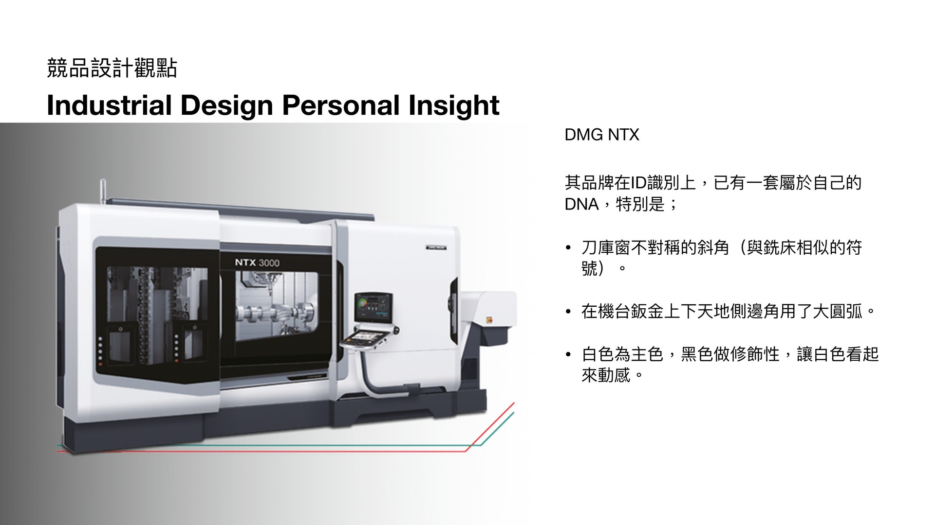
The design begins with an in-depth study of the ID language of premium machine-tool brands. By deconstructing the form DNA of competitors like DMG, Mazak, and DOOSAN, I could position a distinctive yet brand-appropriate direction for TAKIZAWA.
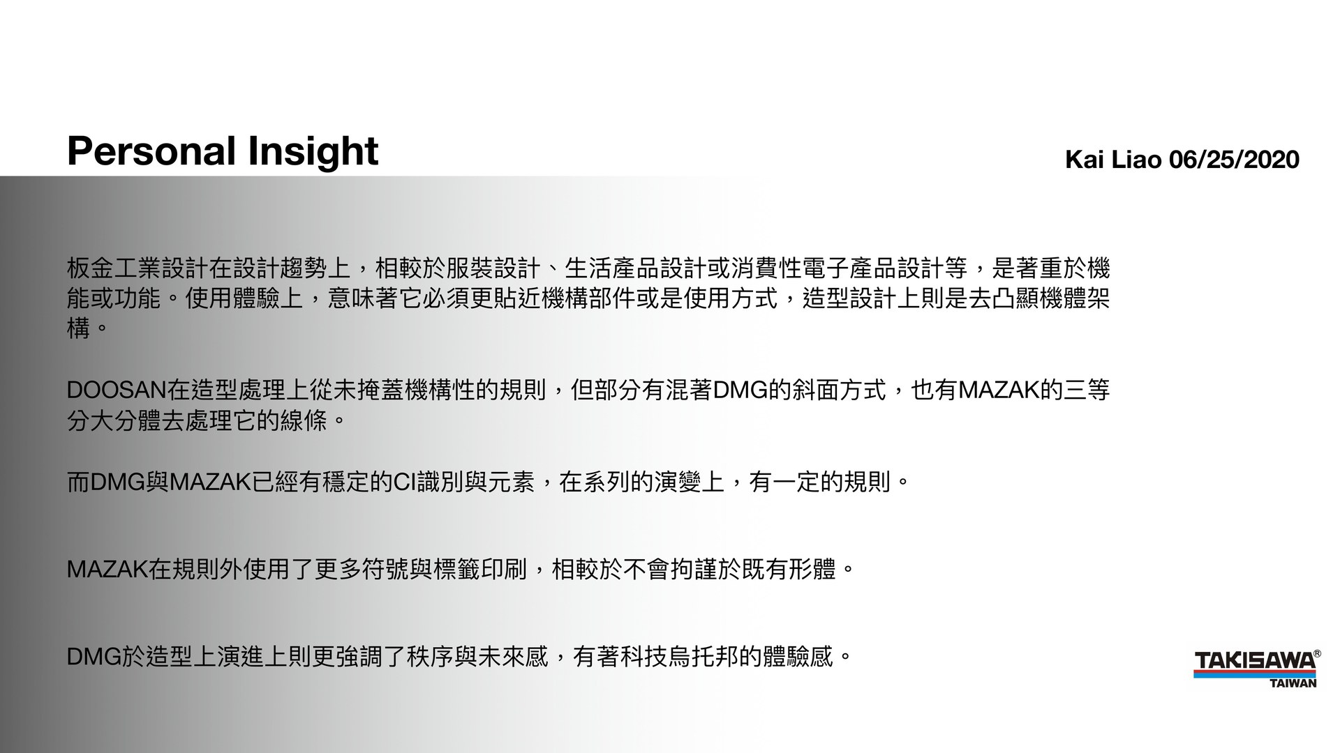
As an actual machine operator, I grounded my design thinking in real observation of machine tools. Unlike fashion or consumer electronics, machine-tool design must prioritize function first, then distill TAKIZAWA's form language from within those functional constraints.
DOOSAN favors chamfered forms; DMG excels in surface continuity and large radii; Mazak identifies through large labels and restrained color. Synthesizing these, TAKIZAWA's design should follow ordered lines with clear rules — conveying both a sense of technology and stable experiential identity.
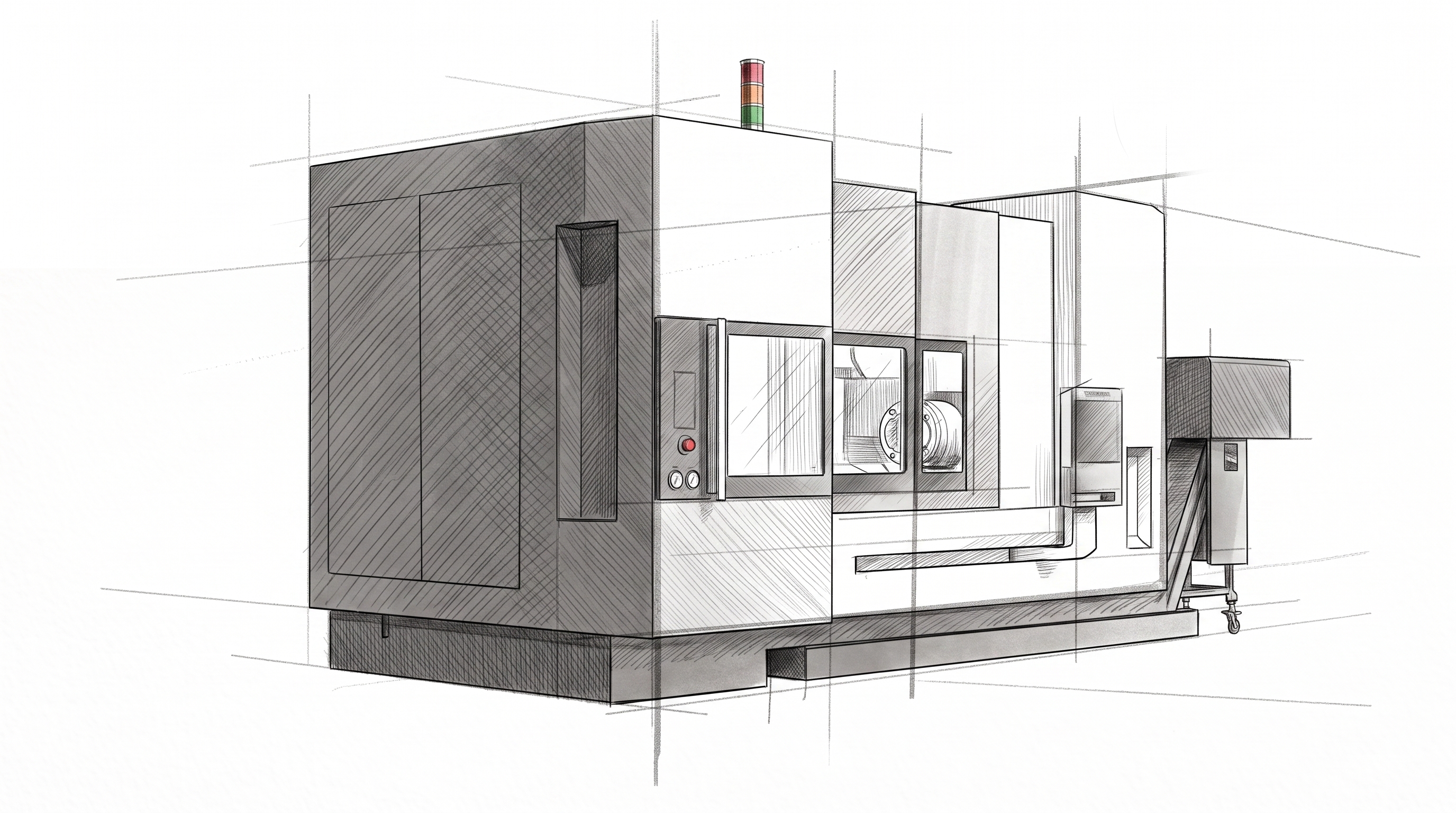
The first proposal direction uses chamfered forms as the primary language, echoing the machine-tool symbols distilled from competitive research while establishing a clear visual center and sense of direction.
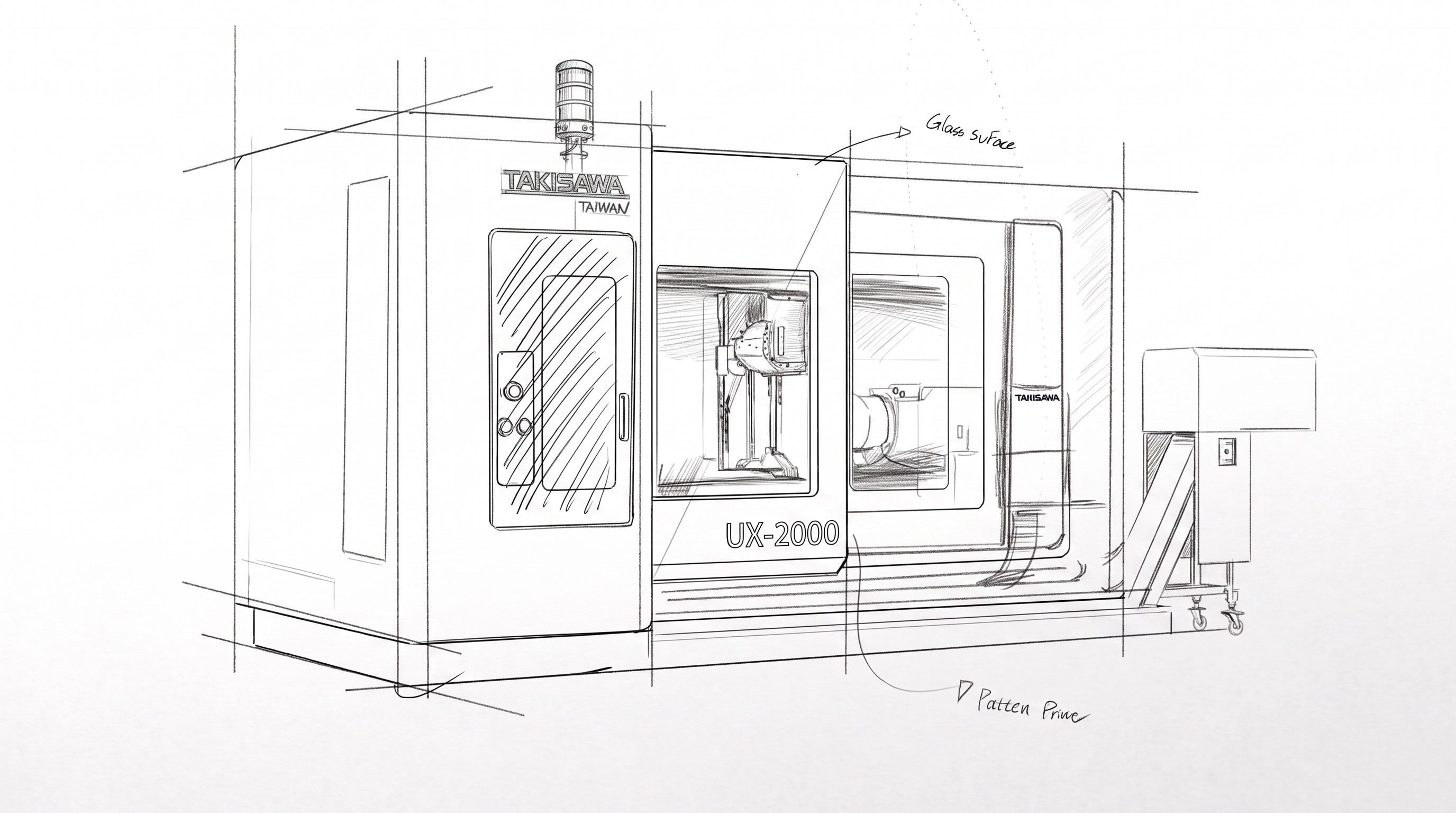
The second direction adopts a different sheet-metal stacking and wrapping logic to create layered depth, introducing a "space future" imagery as the form theme.
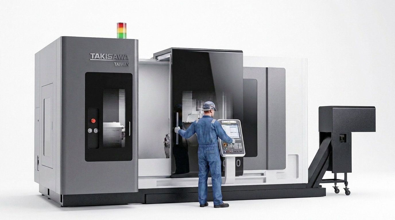
"Space Future" is the core concept threading through TYPE_A. Right-angled, large-area curved surfaces on all four sides emphasize sheet-metal seam colors layering along the curves — echoing the frameless, large-volume aesthetic of space elements.
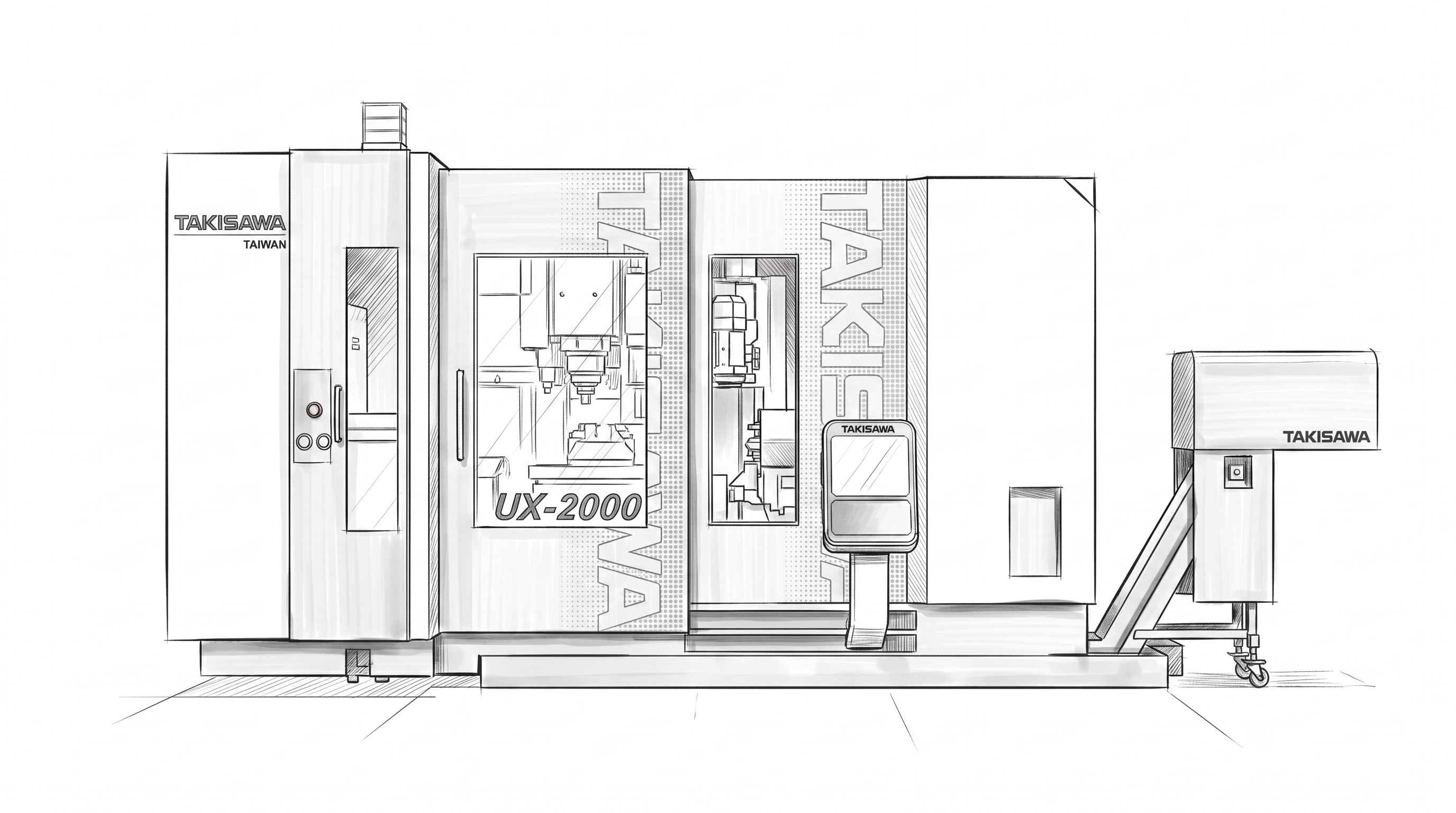
The third direction centers on deconstructed assembly and a black-tone colorway, presenting a more composed, restrained high-end industrial feel.
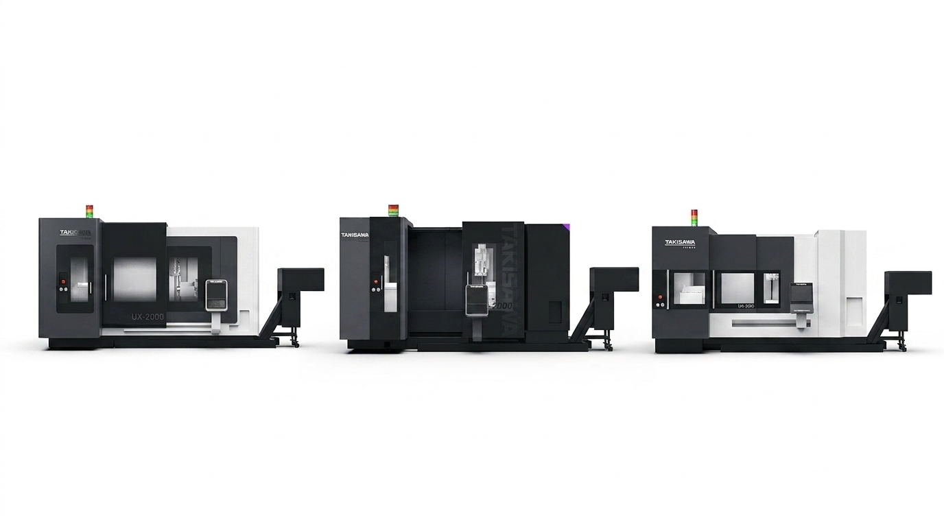
Applying a consistent dark colorway across TYPE_A, TYPE_B, and TYPE_C side by side validates the consistency and recognizability of the form language under a unified CMF system.
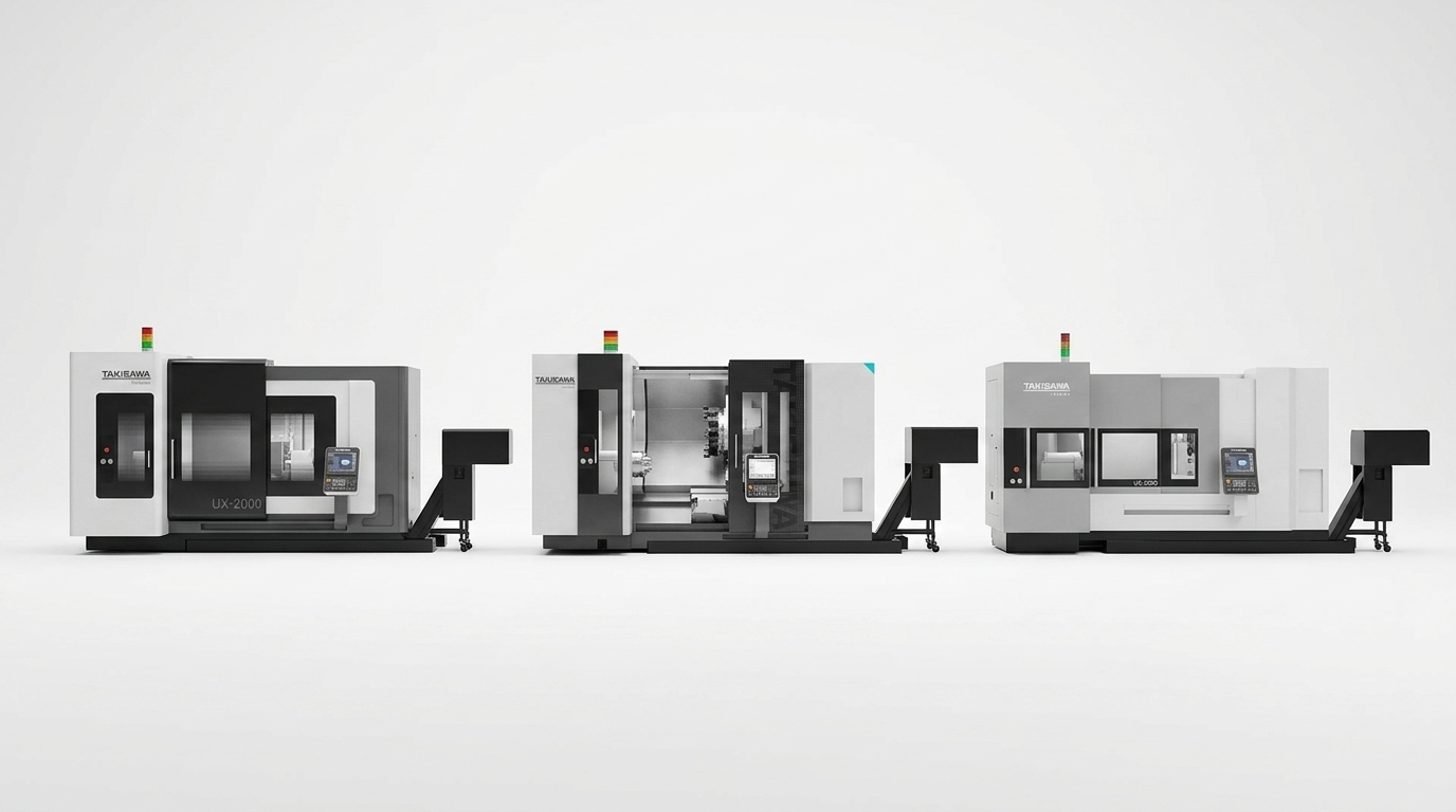
The same three proposals in a light colorway, contrasted against the dark version, fully demonstrate the CMF system’s extensibility — helping decision-makers evaluate across both form and color dimensions.
Starting from 2020 — a year of dramatic change across ecology, politics, economy, humanities, and science — this proposal attempts to translate the mood of the era into a machine-tool form language. With "space travel, total experience, frameless" as its theme, it integrates black tones and deconstructed assembly to convey an individualistic vision of the future.